how's these?
hey mingming asked me to come up with a logo for our class T and i was experimenting with photoshop at this hour (i am not very good at it) and ended up with these:
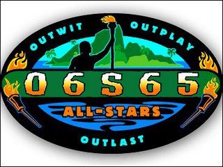

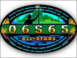
above with names done by senior yiyou!
comments?
the one with accented edges better or the not so bold one better? or both not really nice?
hungry and tired, goodnight!
*EDITED*
AH!!! i realised all the above pictures are in their original sizes. so they are all pathetically SMALL and when i try to enlarge them they got distorted and pixelated. so they are literally SMALL LOGOS. SIGH...

<< Home